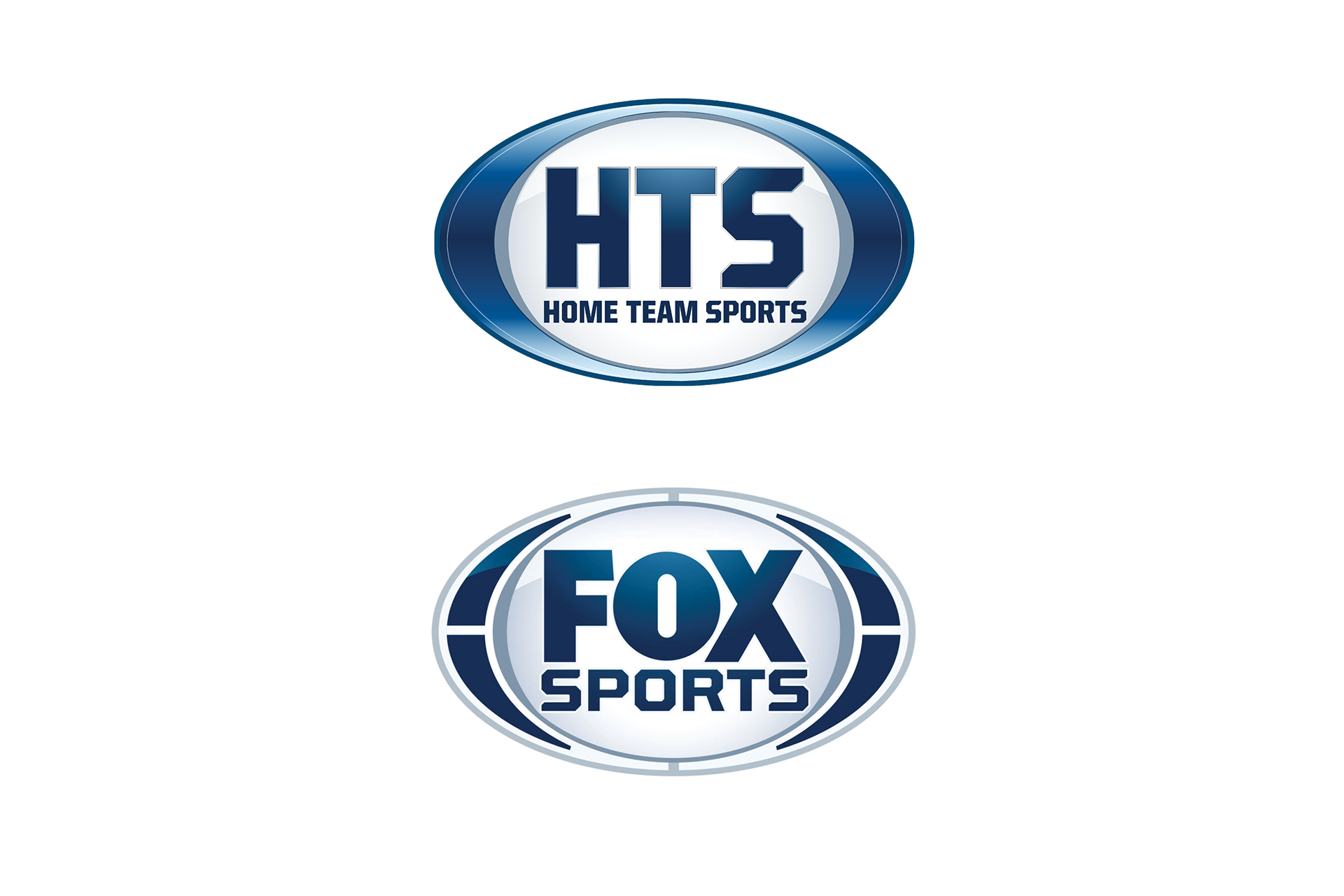
Original Logo
Home Team Sports is a sports media company that specializes in national, regional and local "home team" sports markets.
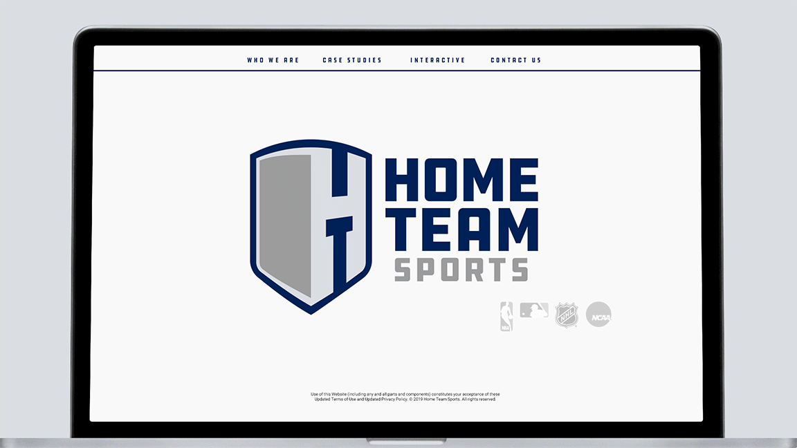
Being heavily involved with the NBA, MLB, NHL and NCAA leagues, their focus isn't the big game of the week, but the hundreds of series games that are on daily. The games the die-hard home team fans watch.
As part of the Fox Broadcasting Family, they were facing an identity crisis of sorts. While technically under the FOX umbrella, they compete with sibling media arms such as FOX Sports and FSN. This was confusing to both internal and external stakeholders.
Home Team Sports wanted a break-away identity that was unique enough to stand apart, but also acknowledged their heritage.

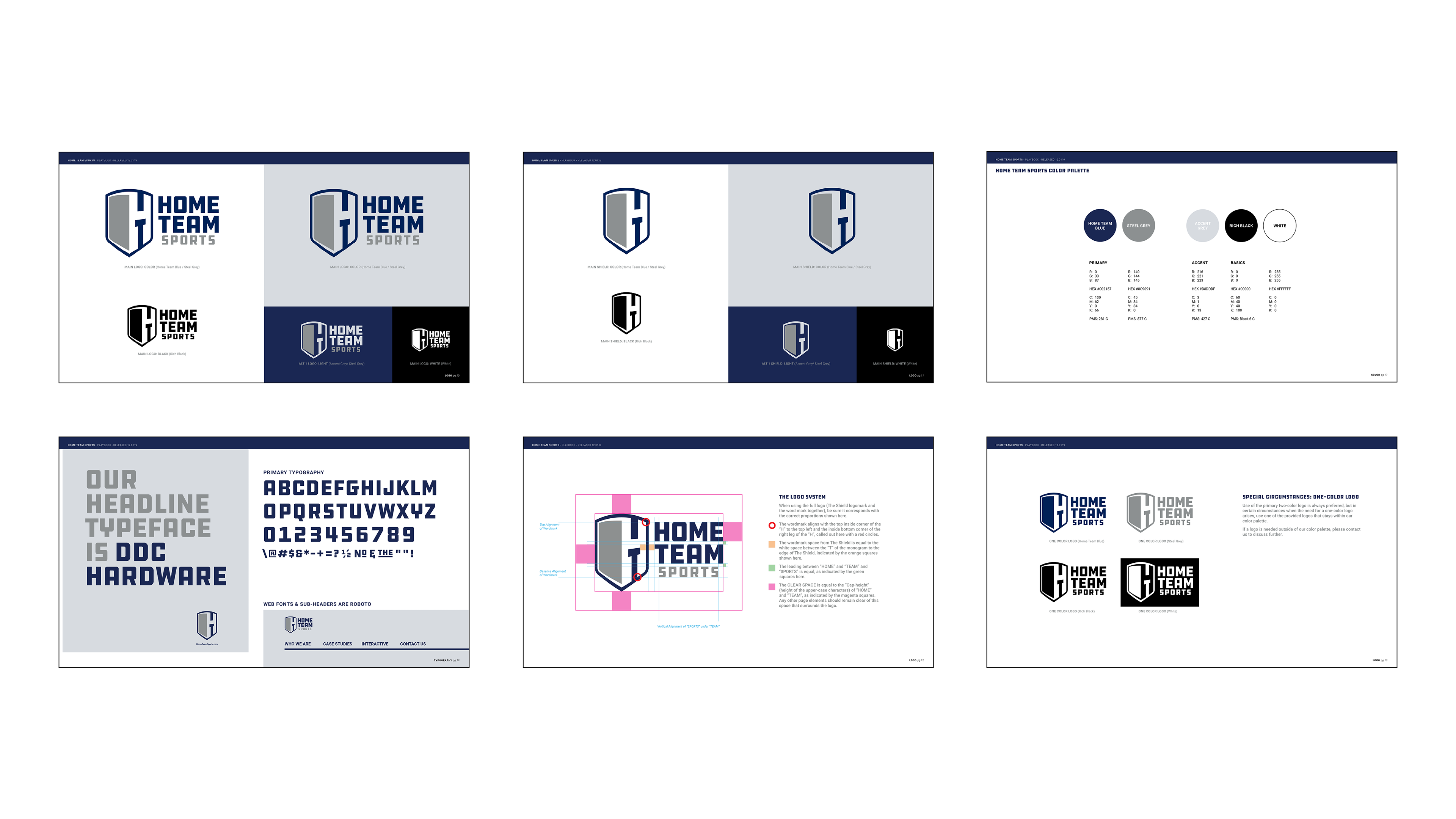
Research showed us that the real power was in their name. By focusing the hierarchy to "HOME TEAM SPORTS" instead of "HTS", the connection to their specialty within the media landscape became clearer, faster.

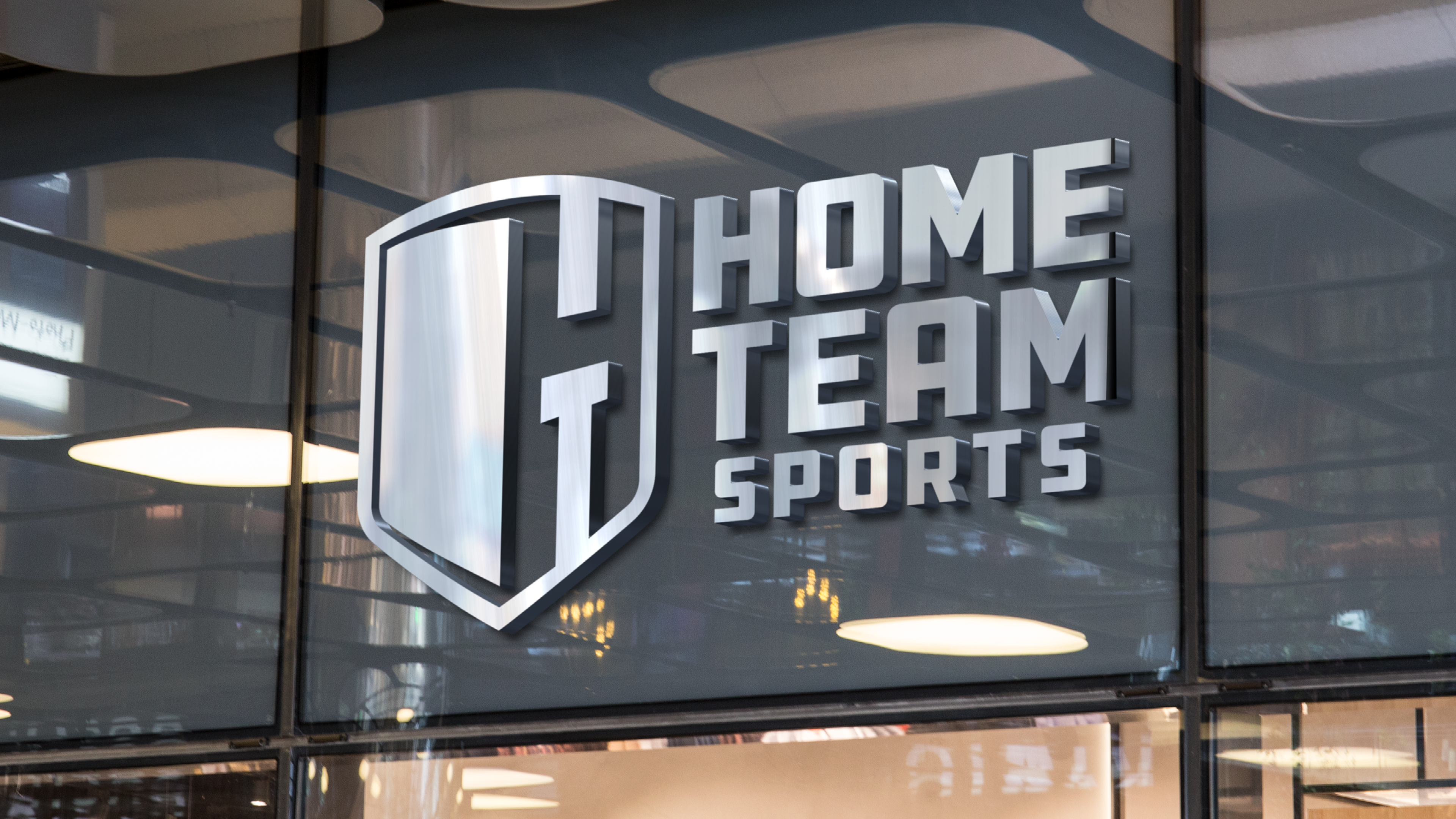
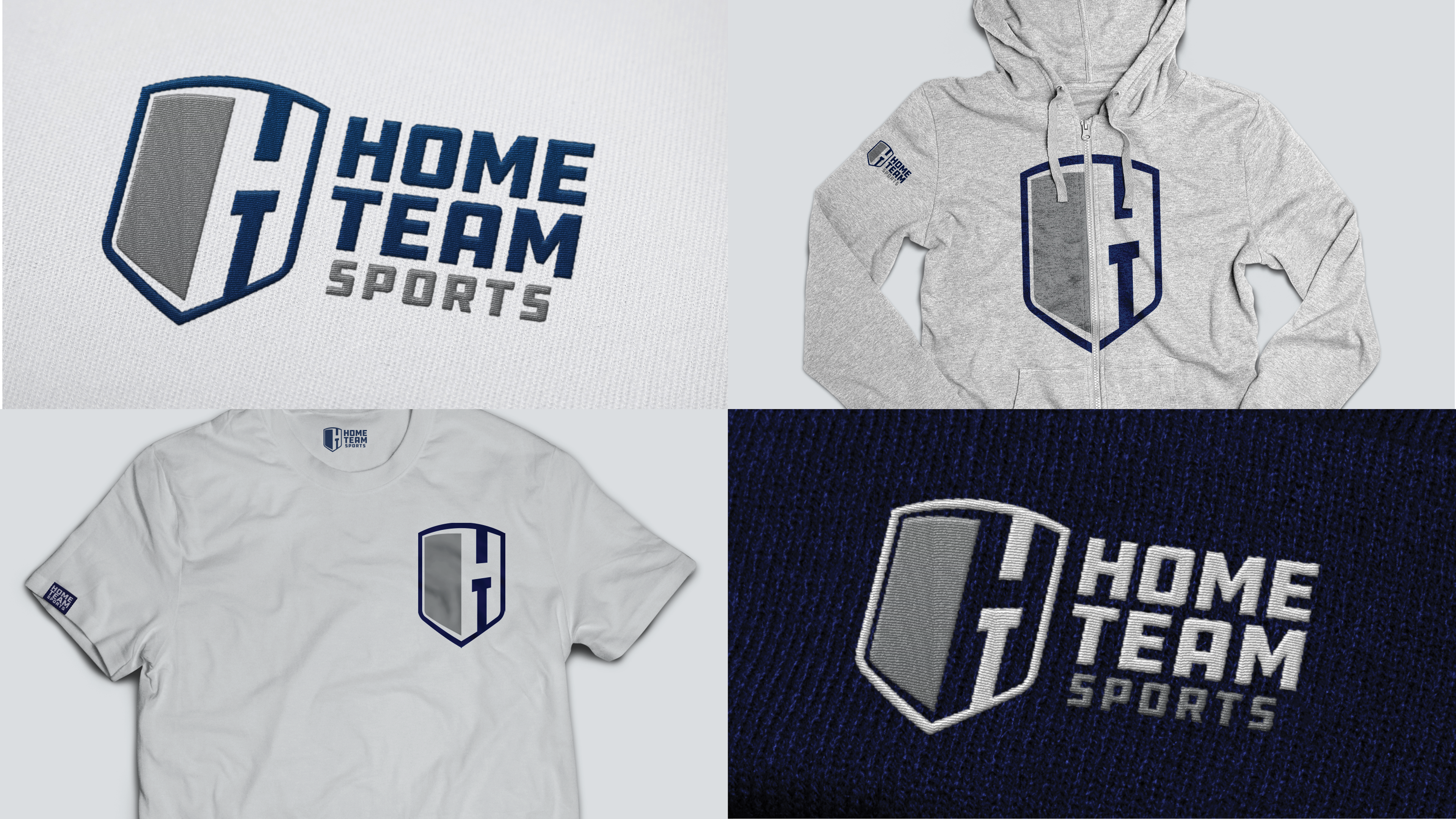
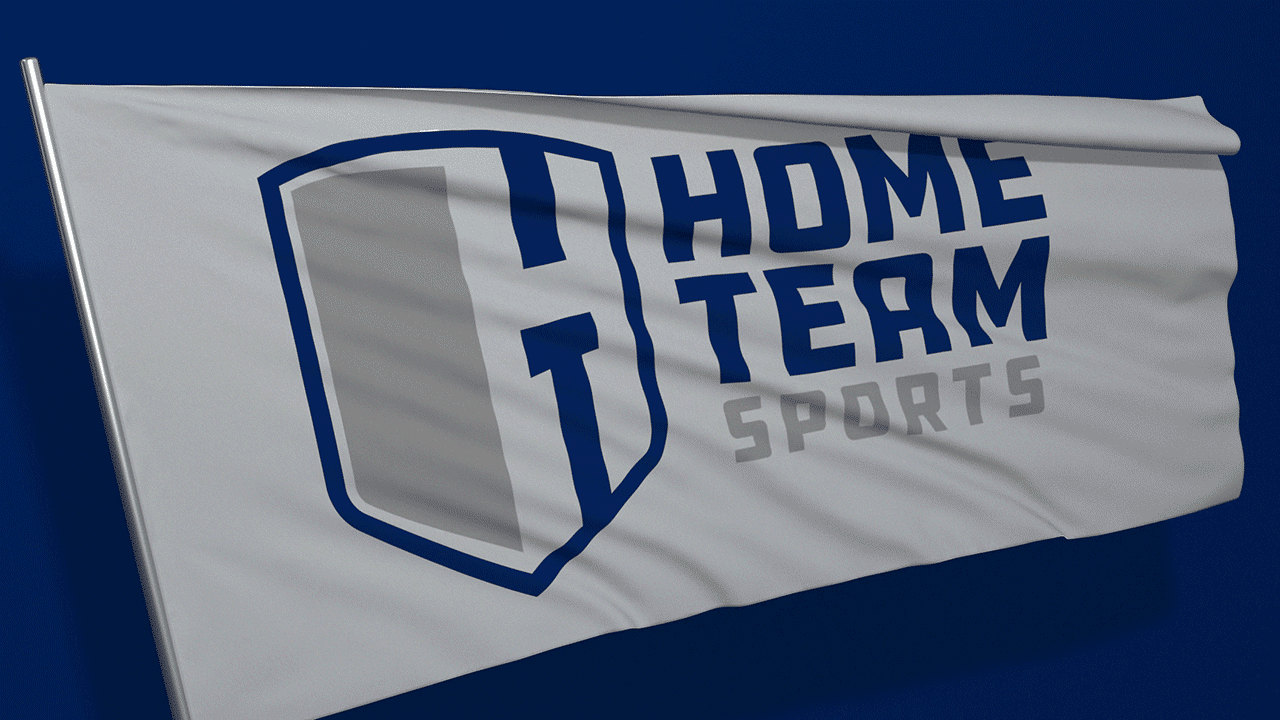
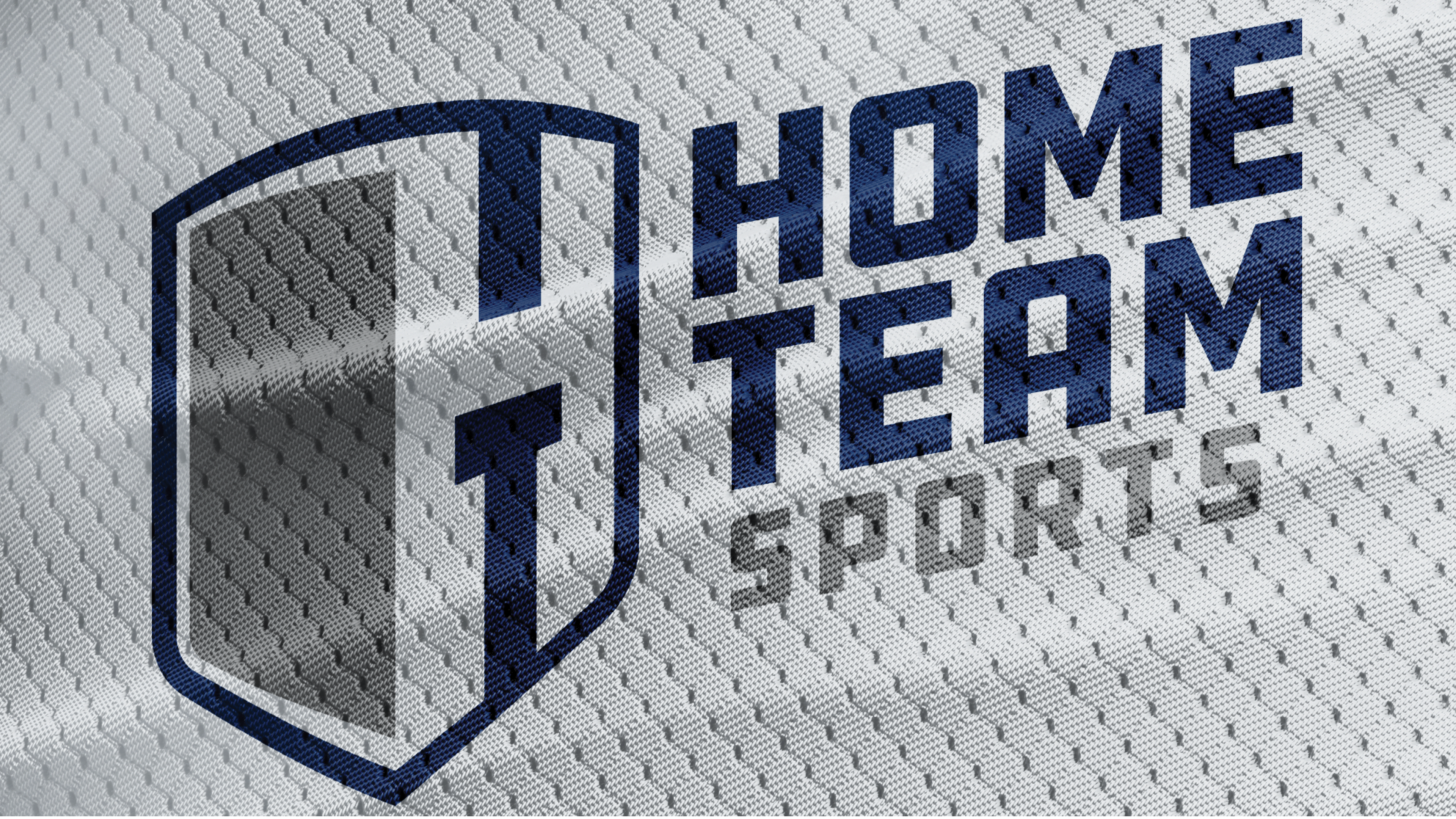
The Shield is representative of their heritage in the competitive sports media landscape. It's a symbol of dedication and willingness to battle for and protect clients and relationships.
The “H” and “T” monogram embedded on the right side of the Shield represents the way the home team is usually positioned second on a scoreboard. The Larger “H” and smaller “T” represents the dedication to the different markets, no matter the size.
The bevel of the shield on the left side, connected to the “H” symbolizes movement, depth and breadth. It represents their forward motion and range of offerings that Home Team Sports provides their clients.