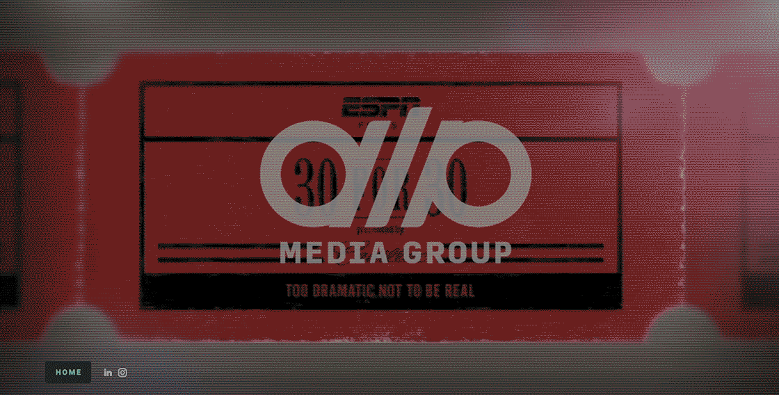
DLP Media Group, an award winning creative & production studio who create high-quality sports branded content like ESPN's "30 for 30 ", wanted to update their look.

Aside from a visual refresh, the logo needed to work harder. There were legibility issues when scaled down and it was time for an update. They liked the symmetrical "DLP" letterforms of their mark and felt it carried some equity in the production industry but it was lacking a little something.
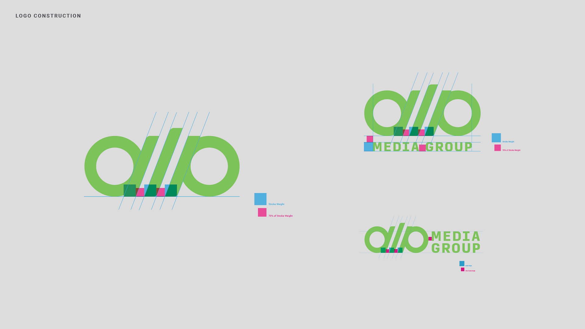
The existing design system was well planned, but a little too complex for their day-to-day needs. There were multiple focal points, so it was stripped down to its frame and rebuilt; focusing on two areas that needed attention, hierarchy and voice.
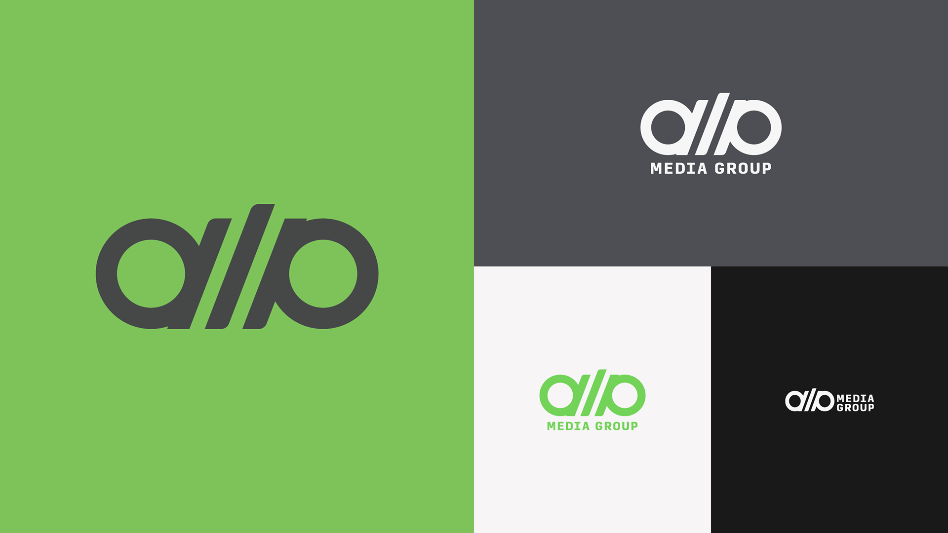
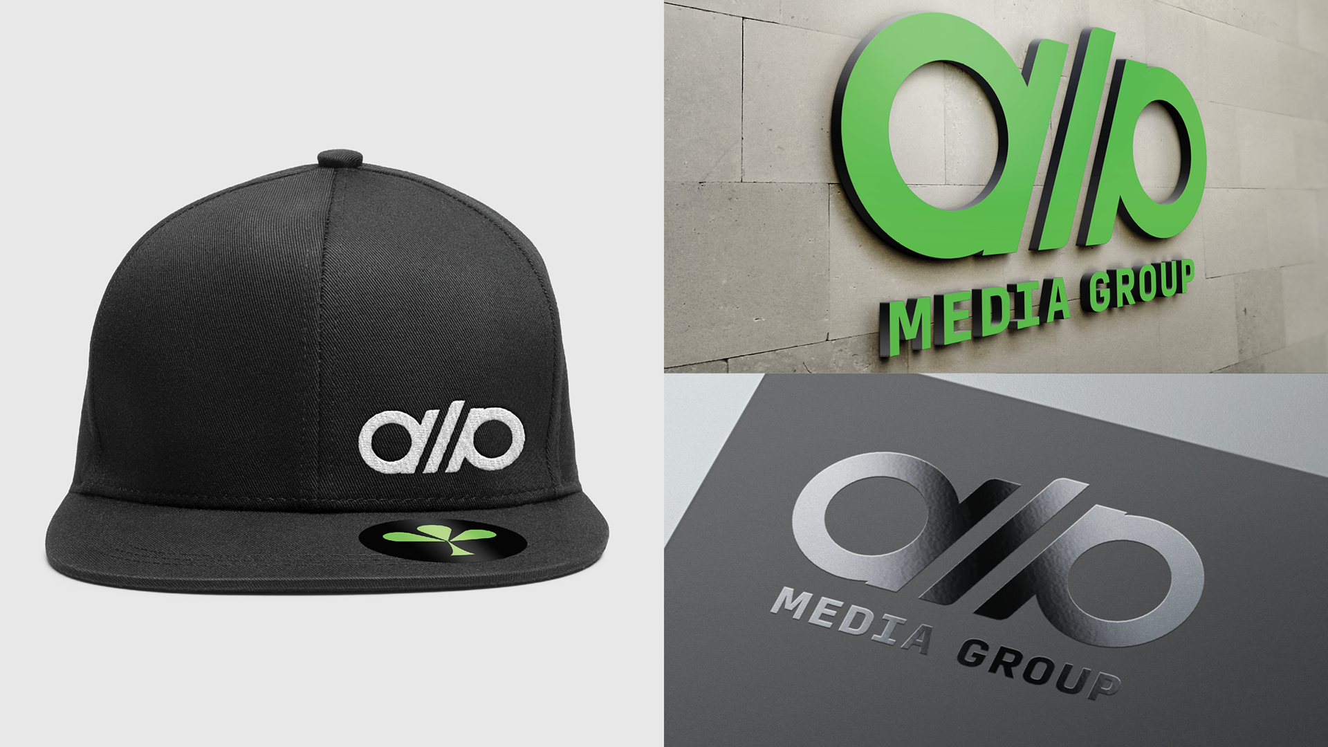
It was also important to have a mark that looked great on apparel so that production partners, clients and employees would be proud wearing on set, in the office or out in the wild.