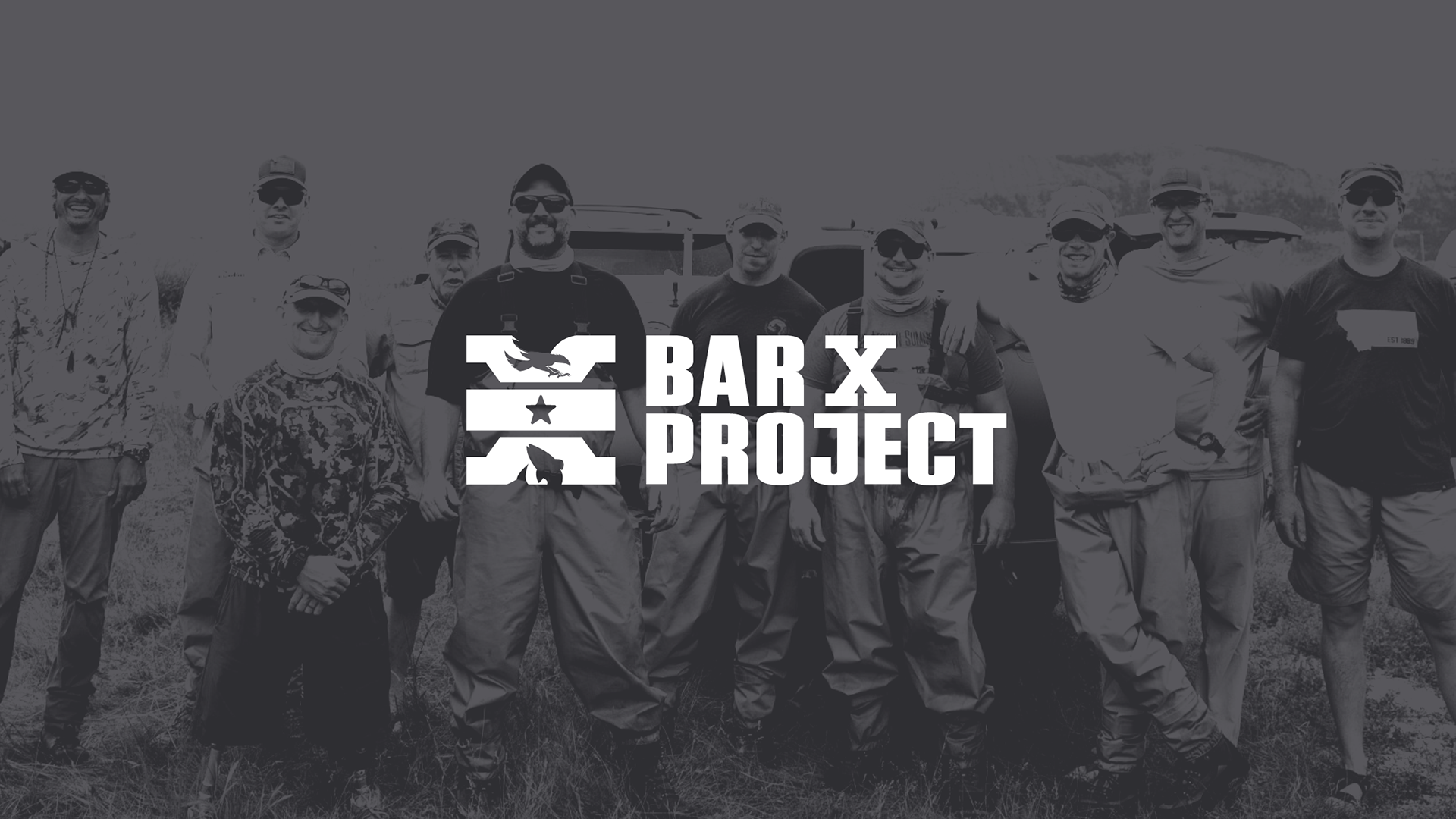
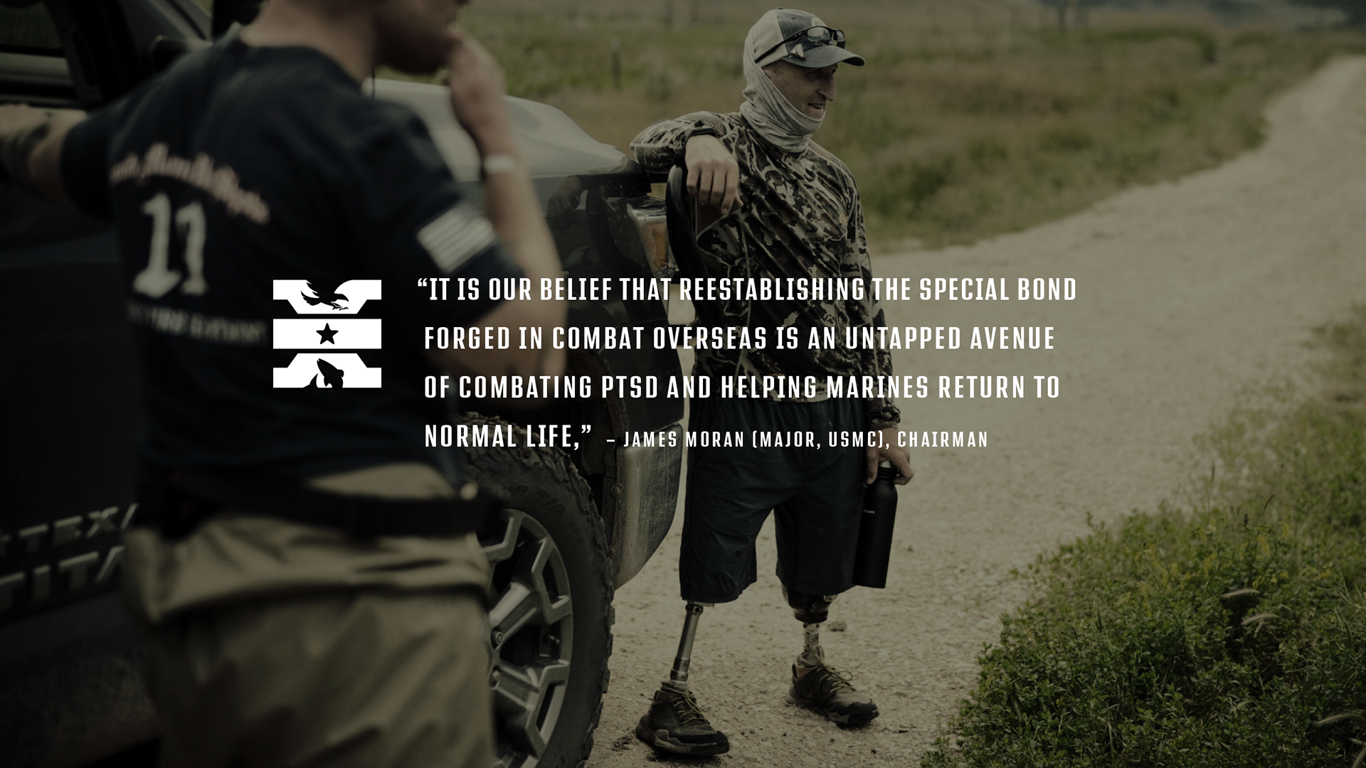
Bar X Project, a non-profit organization that promotes the advanced healing of combat-wounded Marines and Navy Corpsman, approached me to redesign their logo.
The program, conceived and run by Marine Corps Veterans, reunites former unit-members at a ranch in Montana where they spend 3 to 4 days fly-fishing with their former teammates and local guides. The excursion gives these warriors a chance to immerse in nature, re-connect with their brothers-in-arms, make peace with the past and talk about what it takes to move on and succeed in the civilian world.
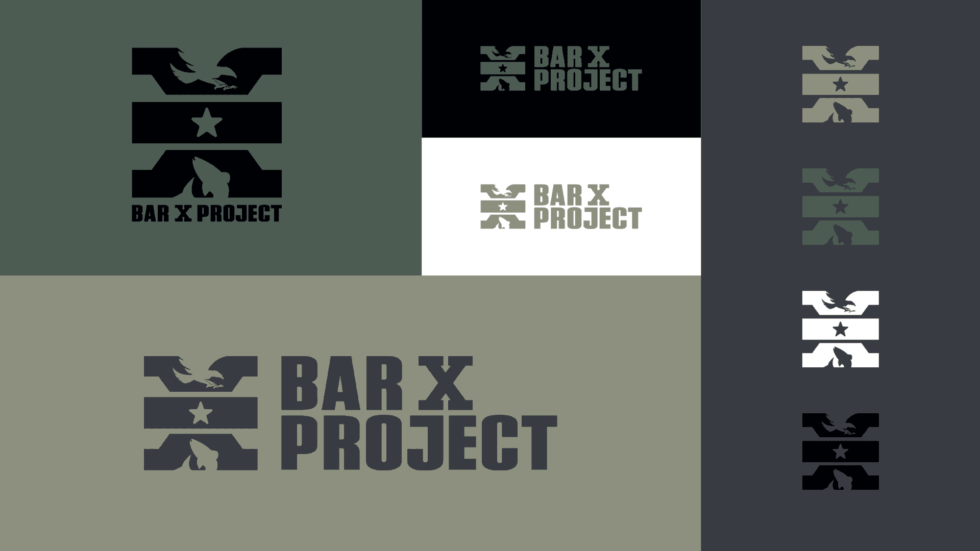
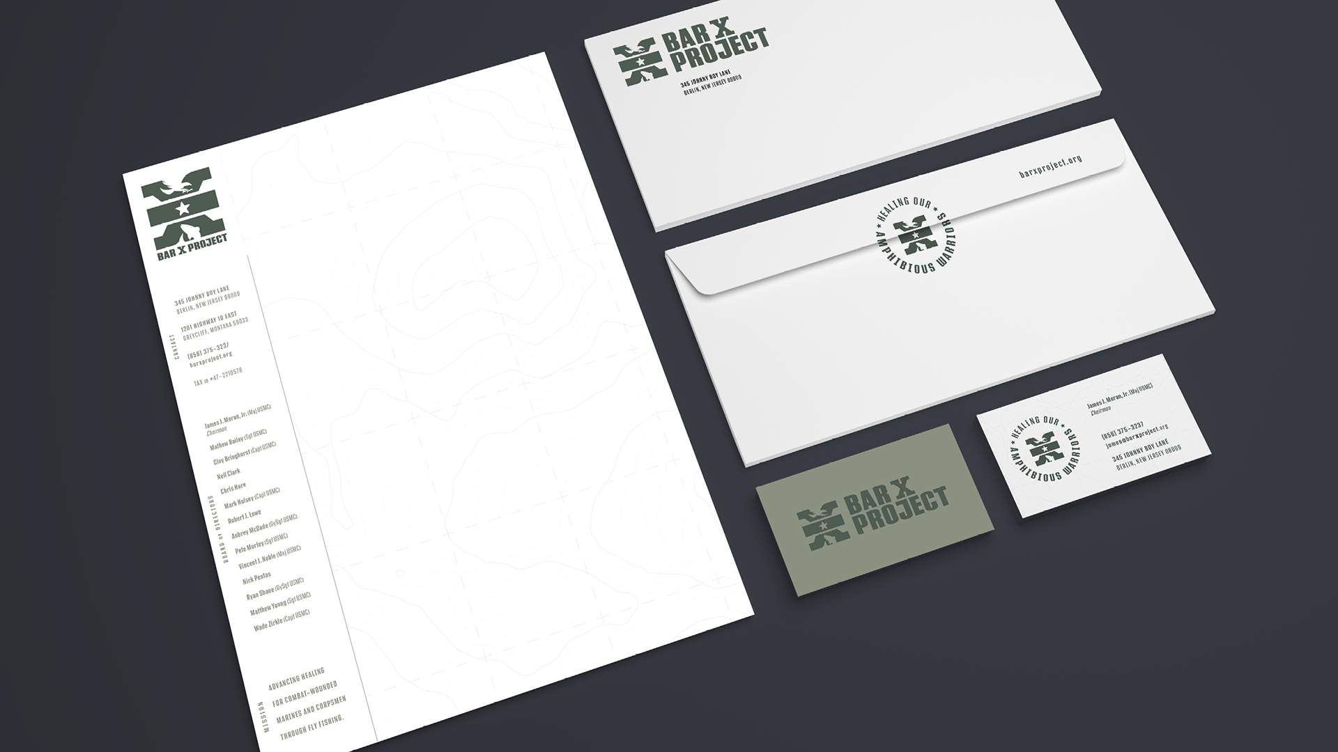
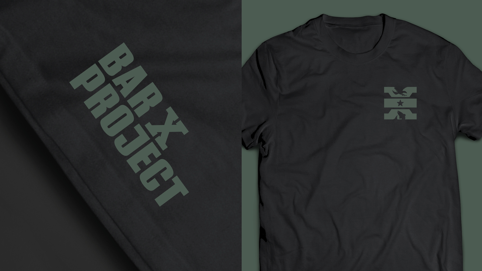
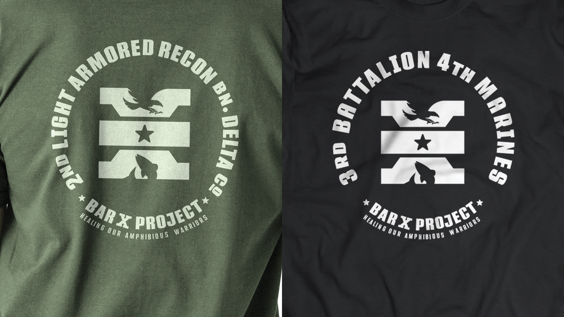
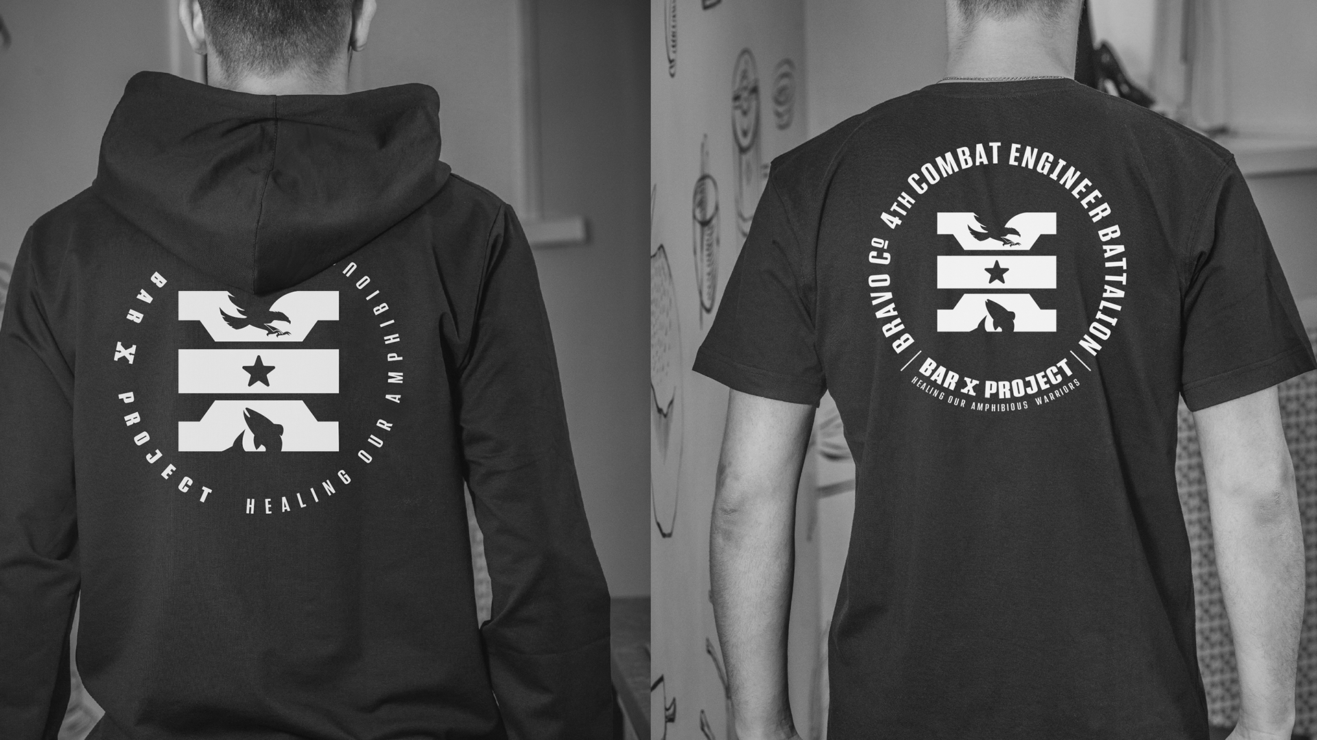
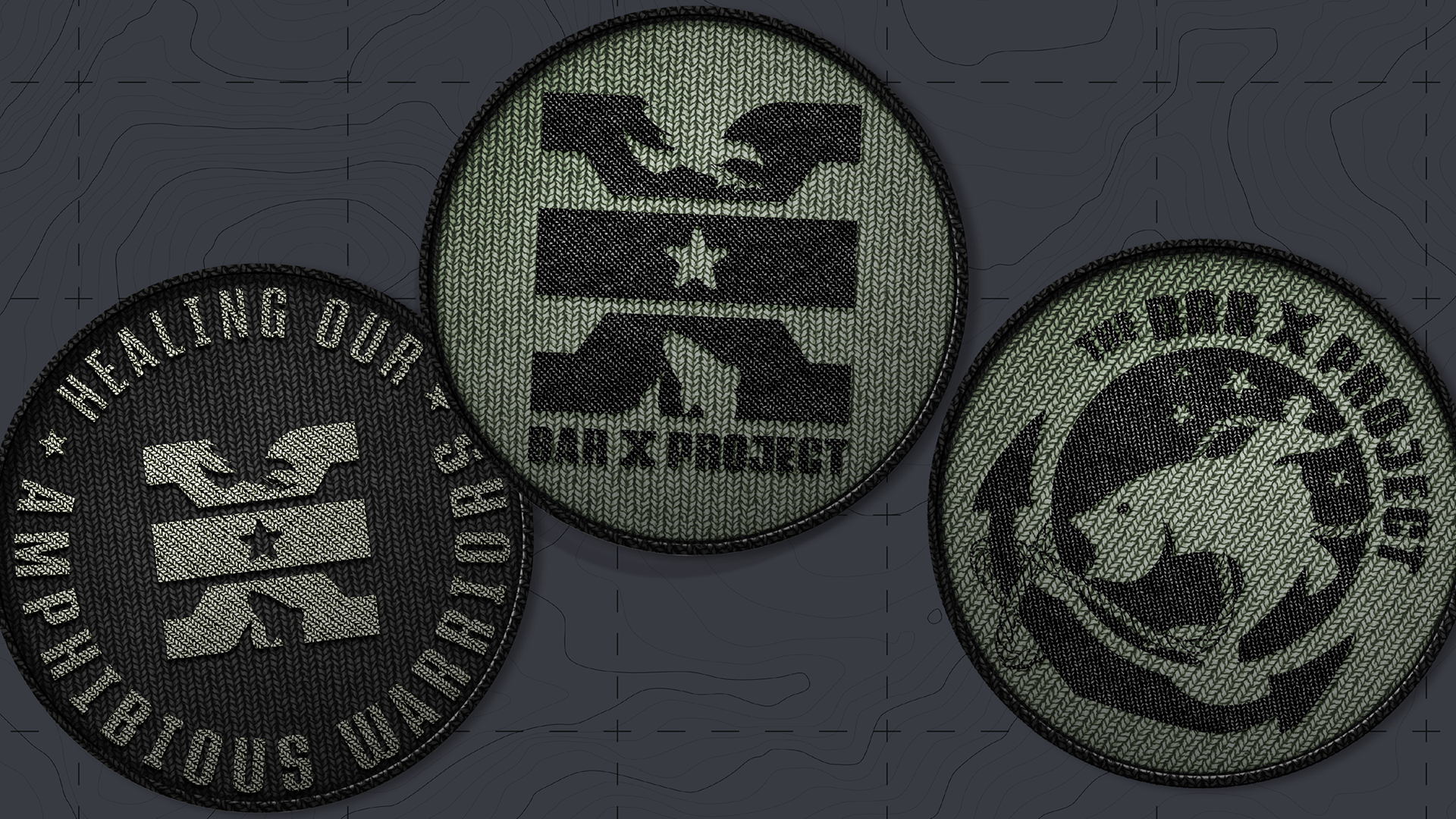
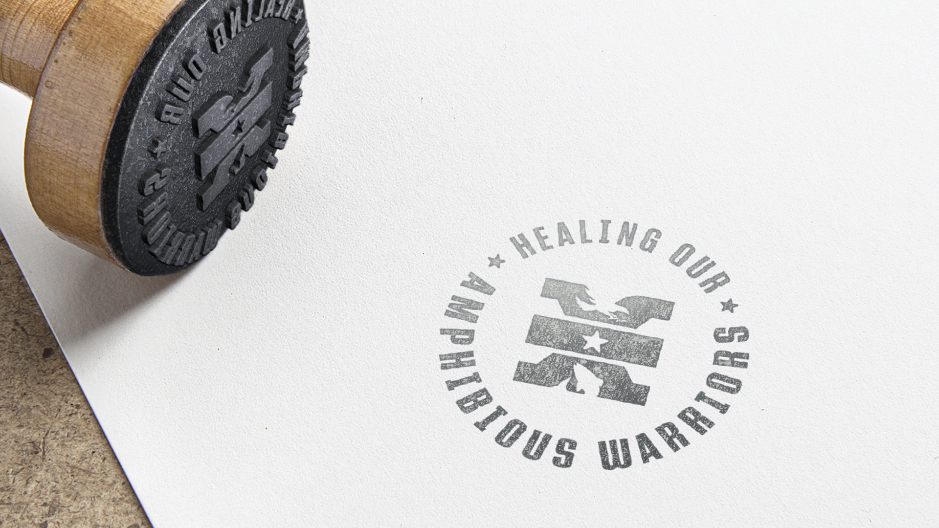
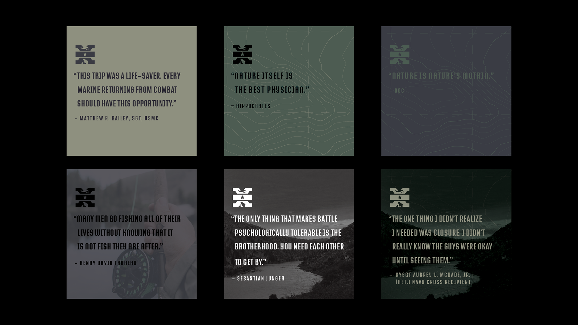
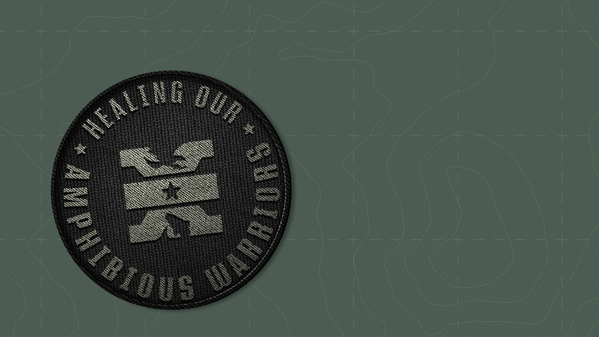
I redesigned the logo, and developed a comprehensive brand identity that I felt represents the very important work that these Marines are doing for their fellow Marines. I'm humbled and honored to have been able to contribute and be a part of this project. Semper Fidelis.

After a few conversations and a project briefing, I went to work researching and distilling the information gained by stakeholders regarding their current logo and what they were and were not looking for.
There was a general consensus that the logo could be better designed but there was still an affinity for what the different elements of the current mark represented. The outdoors, military, fishing, nature and the United States Marine Corps are all well represented, but there was too much going on. The elements were fighting too hard for your attention, lacking hierarchy and harmony.
I began by breaking down the initial exploration into six conceptual directions.
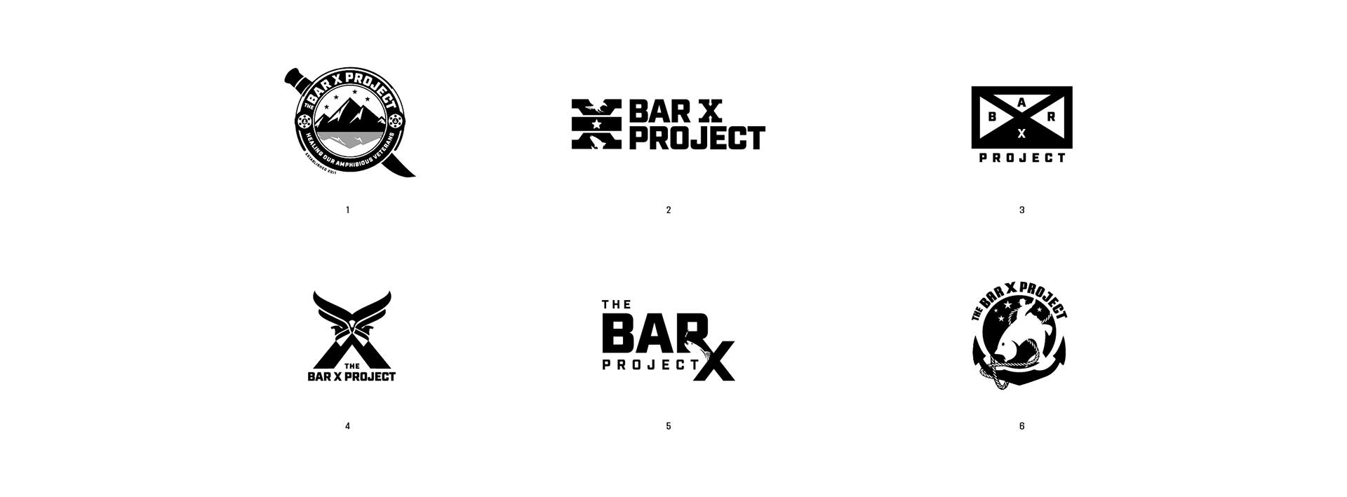
1. REDESIGN
Their original logo was comprised of many elements that symbolized significant things that were meaningful to James Moran, (Major, USMC) the founder and chairman of the organization. It just wasn't executed all that well. This route is a redesign of military, outdoor, fly-fishing and Marine Corps elements, focusing on hierarchy and balance.
2. COME TOGETHER
During my initial calls with the stakeholders, the notion of bringing people together, and bringing the warrior to nature inspired this direction. What makes this program unique from other organizations, is that it brings together those who served together. There was a bond that was formed in combat, and many times these Marines haven't seen each other since a traumatic moment during or immediately after an engagement. This direction focused on the idea of warriors coming together to heal.
3. BRAND
This path is based off of combining the military icon that represents of a Marine Rifle Squad (a rectangle with an x through it) and a modern representation of a cattleman's brand.
4. CONVOCATION OF EAGLES
Here, I combined three eagles, that represent the Marine's unit as the top of an "X" with mountains that make up the bottom of the letterform.
5. HEALING LIGATURE
This route explores the use of the RX symbol, which is said to come from the ancient Egyptian symbol of the Eye of Horus to signify protection and healing.
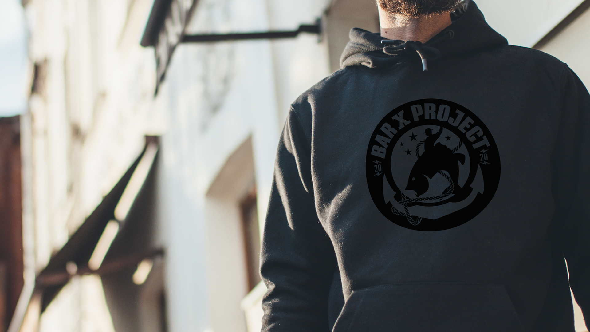
6. BIG BUCKING FISH
This direction focused on showing a Marine on a big bucking fish, placed over a fouled anchor (anchor with rope, that symbolizes "there is work to be done" and/or "a time of troubles")- an obvious nod to the Marine Corps Emblem anchor, under four stars. The stars represent the small groups that attend the project.
This artwork wasn't selected as the logo but everyone felt that it would make a great piece of artwork to represent the Bar X Project.
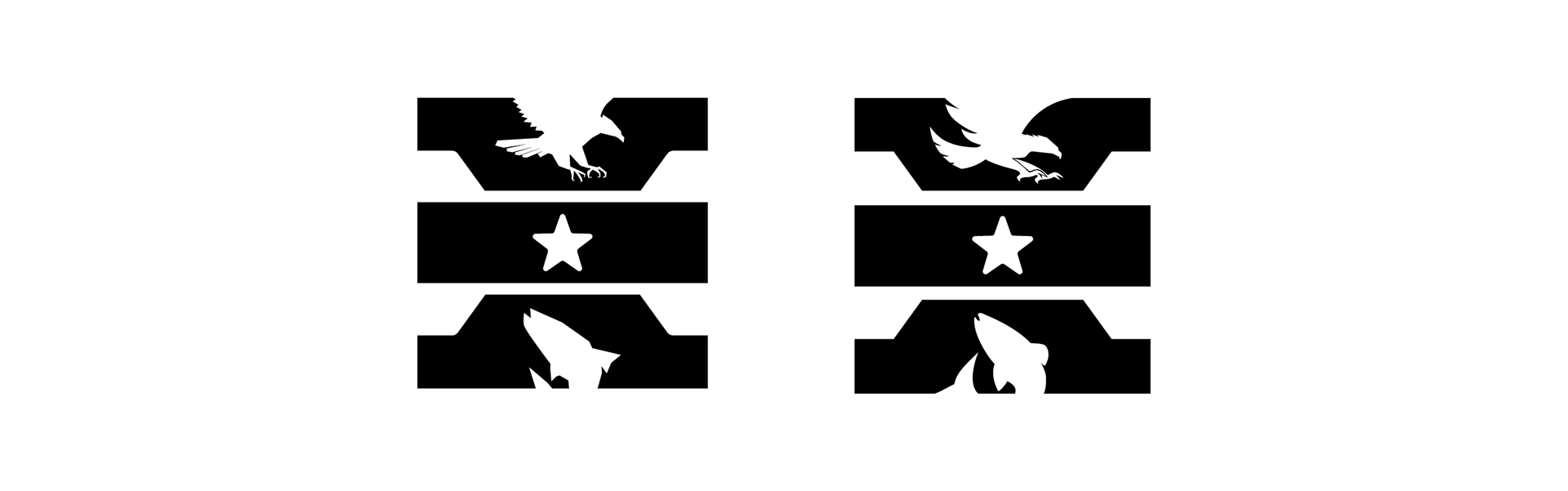
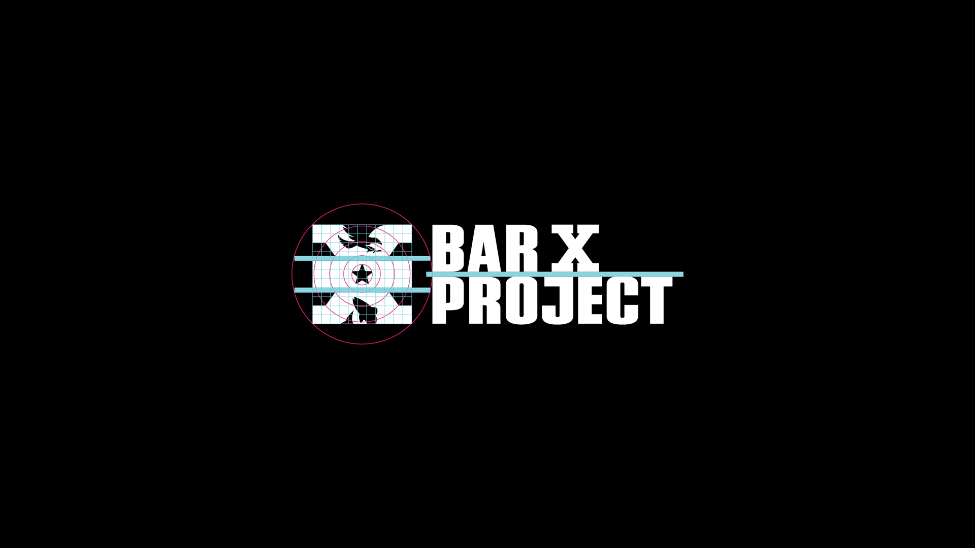
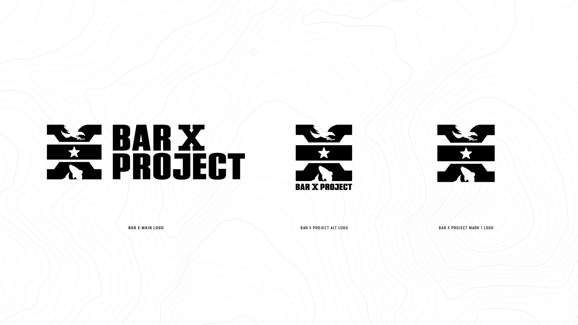
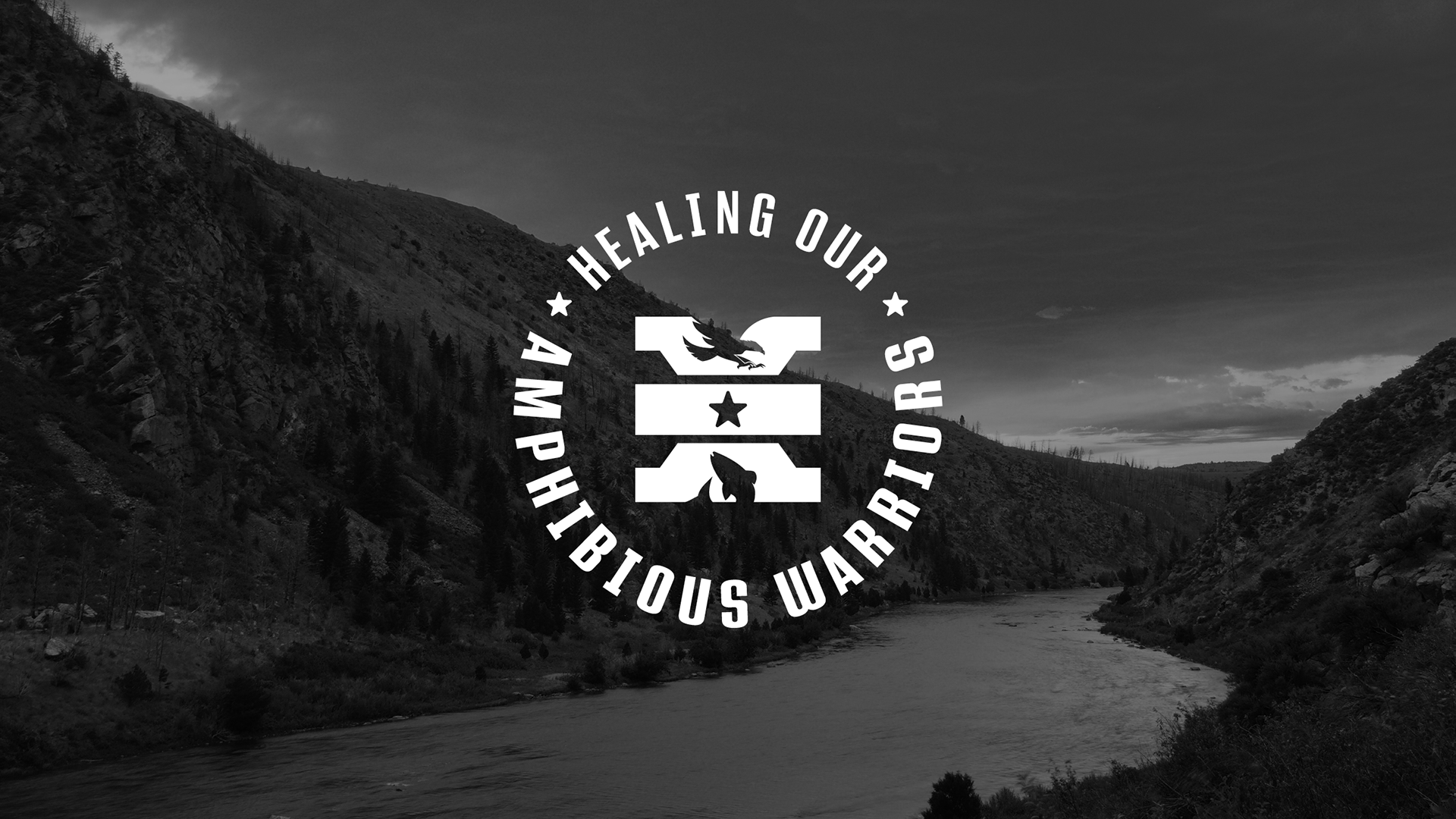
"Coming Together" was chosen as the path to pursue. The eagle and fish shapes needed some crafting, but I had built this graphic on a particular grid, and used the same proportions of a military ribbon for the center bar, so I was happy with the balance, weight and overall look of the mark.